|
Size: 5413
Comment: newlogo6_b.png
|
Size: 9302
Comment: anoop2.png
|
| Deletions are marked like this. | Additions are marked like this. |
| Line 1: | Line 1: |
| #pragma page-filename DEV/versions/8978891 | #pragma page-filename DEV/versions/11501628 {{{#!wiki warning The logo contest was completed in March of 2010, and a [[http://www.list.org/otherstuff.html|new logo]] was chosen from among many excellent entries. This page is for historical purposes only, and editing is closed. See also [[DEV/New Logos|this page]]. }}} |
| Line 4: | Line 8: |
| If you are unable to edit this page, please email us at [[mailto:mailman-cabal@python.org]] with your wiki user id so we can enable it. | The logo contest closed on March 15, 2010. Thank you all for participating. We'll have announcements of the next phase in the contest soon. - The Mailman Steering Committee |
| Line 14: | Line 18: |
| '''Author name''' | '''#''' || '''Author name''' |
| Line 20: | Line 25: |
| Dragon De Monsyne | || Dragon De Monsyne |
| Line 26: | Line 32: |
| Andrija Arsic | 1 || Andrija Arsic |
| Line 32: | Line 39: |
| Andrija Arsic | 2 || Andrija Arsic |
| Line 38: | Line 46: |
| Brian Carpenter <<BR>> | 3 || Brian Carpenter <<BR>> |
| Line 44: | Line 53: |
| Andrija Arsic | 4 || Andrija Arsic |
| Line 50: | Line 60: |
| Andrija Arsic | 5 || Andrija Arsic |
| Line 56: | Line 67: |
| Brian Carpenter <<BR>> | 6 || Brian Carpenter <<BR>> |
| Line 62: | Line 74: |
| Brian Carpenter <<BR>> | 7 || Brian Carpenter <<BR>> |
| Line 68: | Line 81: |
| Andrija Arsic | 8 || Andrija Arsic |
| Line 74: | Line 88: |
| Lisandro Martinez Basabilvaso | 9 || Lisandro Martinez Basabilvaso |
| Line 80: | Line 95: |
| Brian Carpenter <<BR>> | 10 || Brian Carpenter <<BR>> |
| Line 86: | Line 102: |
| Andrija Arsic | 11 || Andrija Arsic |
| Line 92: | Line 109: |
| Rae French <<BR>> | 12 || Rae French <<BR>> |
| Line 98: | Line 116: |
| Brian Carpenter <<BR>> | 13 || Brian Carpenter <<BR>> |
| Line 104: | Line 123: |
| Claudia Schmidt, Patrick Koetter<<BR>> || c@state-of-mind.de,<<BR>> p@state-of-mind.de <<BR>> |
14 || Claudia Fleiner, Patrick Koetter <<BR>> || c@state-of-mind.de, <<BR>>p@state-of-mind.de <<BR>> |
| Line 110: | Line 130: |
| Claudia Schmidt, Patrick Koetter || c@state-of-mind.de,<<BR>> p@state-of-mind.de |
15 || Claudia Fleiner, Patrick Koetter || c@state-of-mind.de, <<BR>>p@state-of-mind.de |
| Line 116: | Line 137: |
| Claudia Schmidt, Patrick Koetter || c@state-of-mind.de,<<BR>> p@state-of-mind.de |
16 || Claudia Fleiner, Patrick Koetter || c@state-of-mind.de, <<BR>>p@state-of-mind.de |
| Line 120: | Line 142: |
| || Variant of 1a without "metal"-effect. More cool and elegant. Less fancy. Works well as an icon or logo in situations when Mailman is used within the context of another website, where the website design should have the design lead.<<BR>> == Claudia Schmidt, Patrick Koetter || c@state-of-mind.de,<<BR>> p@state-of-mind.de |
|| Variant of 1a without "metal"-effect. More cool and elegant. Less fancy. Works well as an icon or logo in situations when Mailman is used within the context of another website, where the website design should have the design lead. <<BR>> == 17 || Claudia Fleiner, Patrick Koetter || c@state-of-mind.de, <<BR>>p@state-of-mind.de |
| Line 128: | Line 151: |
| Claudia Schmidt, Patrick Koetter || c@state-of-mind.de,<<BR>> p@state-of-mind.de |
18 || Claudia Fleiner, Patrick Koetter || c@state-of-mind.de, <<BR>>p@state-of-mind.de |
| Line 132: | Line 156: |
| || "Mailman" in a speech bubble, because people use "Mailman" to communicate. A very modern approach that brushes off the dust of "mailing list managers" and puts it into context with forums, jabber, twitter et. al.<<BR>> == Claudia Schmidt, Patrick Koetter || c@state-of-mind.de,<<BR>> p@state-of-mind.de |
|| "Mailman" in a speech bubble, because people use "Mailman" to communicate. A very modern approach that brushes off the dust of "mailing list managers" and puts it into context with forums, jabber, twitter et. al. <<BR>> == 19 || Claudia Fleiner, Patrick Koetter || c@state-of-mind.de, <<BR>>p@state-of-mind.de |
| Line 138: | Line 163: |
| || A more compact version. More modern, more icongraphic.<<BR>> == Claudia Schmidt, Patrick Koetter || c@state-of-mind.de,<<BR>> p@state-of-mind.de |
|| A more compact version. More modern, more icongraphic. <<BR>> == 20 || Claudia Fleiner, Patrick Koetter || c@state-of-mind.de, <<BR>>p@state-of-mind.de |
| Line 144: | Line 170: |
| || A tribute to the current, established logo. A classic typo that alludes to the postal stamp in the old logo. The stripes play along the stripes on the old logo, but use a cleaner form, well suited for on- and offline usage.<<BR>> == Claudia Schmidt, Patrick Koetter || c@state-of-mind.de,<<BR>> p@state-of-mind.de |
|| A tribute to the current, established logo. A classic typo that alludes to the postal stamp in the old logo. The stripes play along the stripes on the old logo, but use a cleaner form, well suited for on- and offline usage. <<BR>> == 21 || Claudia Fleiner, Patrick Koetter || c@state-of-mind.de, <<BR>>p@state-of-mind.de |
| Line 151: | Line 178: |
| == 22 || Brian Carpenter || brian@emwd.com || || {{attachment:newlogo6.jpg|align=center}}<<BR>> <<BR>> {{attachment:newlogo6_b.png|align=center}}<<BR>> || <<BR>> == 23 || Claudia Fleiner, Patrick Koetter || c@state-of-mind.de, <<BR>>p@state-of-mind.de || || {{attachment:Logo3-variante.png|align=center}}<<BR>> || The stripes on their own. A reduced version of 3 suited to use as an icon in a browser bookmark (favicon) or on a desktop. == 24 || Lisandro Martinez Basabilvaso || lisandro@gmail.com || n/a || {{attachment:mm192x192.jpg}} || == 25 || Lisandro Martinez Basabilvaso || lisandro@gmail.com || n/a || {{attachment:m1m1192x192.jpg|align=center}}<<BR>><<BR>> || == 26 || Lisandro Martinez Basabilvaso || lisandro@gmail.com || n/a || {{attachment:mailman-face.jpg|align=center}}<<BR>> || == 27 || Sven Anderson || sven(at)anderson.de || n/a || {{attachment:mm_logo_simple.png}} {{attachment:mm_logo_favicon.png}} {{attachment:mm_logo.png}} {{attachment:mm_logo_blue.png}} <<BR>> <<BR>> {{attachment:mm_logo_text.png}} <<BR>><<BR>>'''Rectangular variant, emphasizing the envelope shape:''' <<BR>><<BR>>{{attachment:mm_logo_rect_simple.png}} {{attachment:mm_logo_rect.png}} || '''Idea:''' The main element are the two triangles facing each other in a circle. The icons here are just examples how to implement that idea. The coloring and other details can be adapted. The first simple version is a reference to the old "stamp" logo and is suitable as a favicon. <<BR>>'''Background:''' the two triangles symbolize: * both the letter "M" and an envelope, * two arrows, representing the multidirectional communication, * a bow tie, reminding of a butler, representing the service, * the "natural join" operator in relational algebra, a nice allegory for a mailing list. == 28 || Jason Cobill <<BR>> || jasond0tcobillatgmaild0tcom || n/a || {{attachment:JC_Mailman_Logo.png|align=center}} {{attachment:JC_Mailman3_WordmarkLockup.png|align=center}} || A literal "mailman", with the latest version number embedded in the lower right corner. Uniform, colours, pose, gender, etc could change with every major release to make an evolving set of stamps. <<BR>>The wordmark is set in Century Gothic, a formal type used by postal services. <<BR>>SVG files available on request. <<BR>> == 29 || Larry Hastings<<BR>> || larryathastingsdotorg || n/a || {{attachment:mailman.3.a.capella.png}} || An 8-bit postage cancellation mark, inspired by the current logo. Original is in SVG format.<<BR>> == 30 || Carson Brown <<BR>> || carson@ccsl.carleton.ca || n/a || {{attachment:carson-mailman.png|align=centre}} || A simplified postage stamp for mailman (original is in SVG) <<BR>> == 31 || Carson Brown <<BR>> || carson@ccsl.carleton.ca || n/a || {{attachment:carson-mailman-with-cancel.png}} || The above but with a post office "cancel" stamp. <<BR>> == 32 || Carson Brown <<BR>> || carson@ccsl.carleton.ca || n/a || {{attachment:mailman-just-envelope.png|align=centre}} || Just the envelope. <<BR>> }}} = Additional logo submissions = Some logos were submitted after the contest was closed. For historical purposes, these are enumerated below. {{{#!table '''Author name''' || '''Logo''' || '''Date submitted''' == Anoop Thomas Matthew || || 2011-03-04 == Anoop Thomas Matthew || || 2011-03-04 |
The logo contest was completed in March of 2010, and a new logo was chosen from among many excellent entries. This page is for historical purposes only, and editing is closed. See also this page.
2010 Mailman Logo Submission Page
The logo contest closed on March 15, 2010. Thank you all for participating. We'll have announcements of the next phase in the contest soon. - The Mailman Steering Committee
This page is solely for submissions in the 2010 Mailman new logo contest. Please read that page for guidelines and rules. Note that to facilitate an open submission process yet minimally deal with wiki spam, the restrictions on editing this page have been loosened. You need to register with the wiki, but you do not need to ask for special permission to edit the page. We're watching for spam and inappropriate content though, so please be kind!
To submit a logo, please add a preview of your logo to the bottom of this table. If you have more than one submission, just add another row. If your logo has multiple variants (i.e. slightly different designs at different sizes) you can add them to the same table row, but don't go overboard. If you have lots of variants, please just include a link to your own website were we can see the rest of them.
Enjoy!
| # | Author name | Author email | Logo website | Logo | Notes |
| Dragon De Monsyne | n/a | http://www.list.org/otherstuff.html |  |
Old logo, here for example only | |
| 1 | Andrija Arsic | arsicandrija@gmail.com | n/a |  |
Logo |
| 2 | Andrija Arsic | arsicandrija@gmail.com | n/a |  |
Logo |
| 3 | Brian Carpenter |
brian@emwd.com |  |
I plan on submitting some more as time permits. |
|
| 4 | Andrija Arsic | arsicandrija@gmail.com | n/a |  |
One more sample |
| 5 | Andrija Arsic | arsicandrija@gmail.com | n/a |  |
One more sample.. |
| 6 | Brian Carpenter |
brian@emwd.com |  |
||
| 7 | Brian Carpenter |
brian@emwd.com |  |
||
| 8 | Andrija Arsic | arsicandrija@gmail.com | n/a |  |
Logo sample |
| 9 | Lisandro Martinez Basabilvaso | lisandro@gmail.com | n/a |  |
n/a |
| 10 | Brian Carpenter |
brian@emwd.com |  |
All of my logos can be modified in case you would like something to be changed. |
|
| 11 | Andrija Arsic | arsicandrija@gmail.com | n/a |  |
Logo sample |
| 12 | Rae French |
rae@gitchee.com |  |
Designed in black for easy color change, if needed. Integrated the GNU logo for brand recognition. |
|
| 13 | Brian Carpenter |
brian@emwd.com |  |
Logo can be modified according to need. |
|
| 14 | Claudia Fleiner, Patrick Koetter |
c@state-of-mind.de, p@state-of-mind.de |
 |
Mailman is very well known. It does not need to tell everybody what or who it is. Saying "M" is enough. "M" stands for Mailman. Mailman as a brand. Extra benefit: Works well as an icon too. | |
| 15 | Claudia Fleiner, Patrick Koetter | c@state-of-mind.de, p@state-of-mind.de |
 |
A variation that places "GNU" outside, making the "M" even stronger. | |
| 16 | Claudia Fleiner, Patrick Koetter | c@state-of-mind.de, p@state-of-mind.de |
 |
Variant of 1a without "metal"-effect. More cool and elegant. Less fancy. Works well as an icon or logo in situations when Mailman is used within the context of another website, where the website design should have the design lead. |
|
| 17 | Claudia Fleiner, Patrick Koetter | c@state-of-mind.de, p@state-of-mind.de |
 |
A variation that places "GNU" outside, making "M" stronger. | |
| 18 | Claudia Fleiner, Patrick Koetter | c@state-of-mind.de, p@state-of-mind.de |
 |
"Mailman" in a speech bubble, because people use "Mailman" to communicate. A very modern approach that brushes off the dust of "mailing list managers" and puts it into context with forums, jabber, twitter et. al. |
|
| 19 | Claudia Fleiner, Patrick Koetter | c@state-of-mind.de, p@state-of-mind.de |
 |
A more compact version. More modern, more icongraphic. |
|
| 20 | Claudia Fleiner, Patrick Koetter | c@state-of-mind.de, p@state-of-mind.de |
 |
A tribute to the current, established logo. A classic typo that alludes to the postal stamp in the old logo. The stripes play along the stripes on the old logo, but use a cleaner form, well suited for on- and offline usage. |
|
| 21 | Claudia Fleiner, Patrick Koetter | c@state-of-mind.de, p@state-of-mind.de |
 |
The stripes on their own. A reduced version of 3 suited to use as an icon in a browser bookmark (favicon) or on a desktop. | |
| 22 | Brian Carpenter | brian@emwd.com |   |
||
| 23 | Claudia Fleiner, Patrick Koetter | c@state-of-mind.de, p@state-of-mind.de |
 |
The stripes on their own. A reduced version of 3 suited to use as an icon in a browser bookmark (favicon) or on a desktop. | |
| 24 | Lisandro Martinez Basabilvaso | lisandro@gmail.com | n/a |  |
|
| 25 | Lisandro Martinez Basabilvaso | lisandro@gmail.com | n/a |  |
|
| 26 | Lisandro Martinez Basabilvaso | lisandro@gmail.com | n/a |  |
|
| 27 | Sven Anderson | sven(at)anderson.de | n/a |     Rectangular variant, emphasizing the envelope shape:   |
Idea: The main element are the two triangles facing each other in a circle. The icons here are just examples how to implement that idea. The coloring and other details can be adapted. The first simple version is a reference to the old "stamp" logo and is suitable as a favicon. Background: the two triangles symbolize:
|
| 28 | Jason Cobill |
jasond0tcobillatgmaild0tcom | n/a | 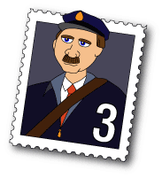  |
A literal "mailman", with the latest version number embedded in the lower right corner. Uniform, colours, pose, gender, etc could change with every major release to make an evolving set of stamps. The wordmark is set in Century Gothic, a formal type used by postal services. SVG files available on request. |
| 29 | Larry Hastings |
larryathastingsdotorg | n/a |  |
An 8-bit postage cancellation mark, inspired by the current logo. Original is in SVG format. |
| 30 | Carson Brown |
carson@ccsl.carleton.ca | n/a |  |
A simplified postage stamp for mailman (original is in SVG) |
| 31 | Carson Brown |
carson@ccsl.carleton.ca | n/a |  |
The above but with a post office "cancel" stamp. |
| 32 | Carson Brown |
carson@ccsl.carleton.ca | n/a |  |
Just the envelope. |
Additional logo submissions
Some logos were submitted after the contest was closed. For historical purposes, these are enumerated below.
| Author name | Logo | Date submitted |
| Anoop Thomas Matthew | 2011-03-04 | |
| Anoop Thomas Matthew | 2011-03-04 |
