|
Size: 5413
Comment: newlogo6_b.png
|
Size: 5565
Comment:
|
| Deletions are marked like this. | Additions are marked like this. |
| Line 1: | Line 1: |
| #pragma page-filename DEV/versions/8978891 | #pragma page-filename DEV/versions/8978894 |
| Line 104: | Line 104: |
| Claudia Schmidt, Patrick Koetter<<BR>> || c@state-of-mind.de,<<BR>> p@state-of-mind.de <<BR>> |
Claudia Schmidt, Patrick Koetter <<BR>> || c@state-of-mind.de, <<BR>>p@state-of-mind.de <<BR>> |
| Line 111: | Line 111: |
| || c@state-of-mind.de,<<BR>> p@state-of-mind.de | || c@state-of-mind.de, <<BR>>p@state-of-mind.de |
| Line 117: | Line 117: |
| || c@state-of-mind.de,<<BR>> p@state-of-mind.de | || c@state-of-mind.de, <<BR>>p@state-of-mind.de |
| Line 120: | Line 120: |
| || Variant of 1a without "metal"-effect. More cool and elegant. Less fancy. Works well as an icon or logo in situations when Mailman is used within the context of another website, where the website design should have the design lead.<<BR>> | || Variant of 1a without "metal"-effect. More cool and elegant. Less fancy. Works well as an icon or logo in situations when Mailman is used within the context of another website, where the website design should have the design lead. <<BR>> |
| Line 123: | Line 123: |
| || c@state-of-mind.de,<<BR>> p@state-of-mind.de | || c@state-of-mind.de, <<BR>>p@state-of-mind.de |
| Line 129: | Line 129: |
| || c@state-of-mind.de,<<BR>> p@state-of-mind.de | || c@state-of-mind.de, <<BR>>p@state-of-mind.de |
| Line 132: | Line 132: |
| || "Mailman" in a speech bubble, because people use "Mailman" to communicate. A very modern approach that brushes off the dust of "mailing list managers" and puts it into context with forums, jabber, twitter et. al.<<BR>> | || "Mailman" in a speech bubble, because people use "Mailman" to communicate. A very modern approach that brushes off the dust of "mailing list managers" and puts it into context with forums, jabber, twitter et. al. <<BR>> |
| Line 135: | Line 135: |
| || c@state-of-mind.de,<<BR>> p@state-of-mind.de | || c@state-of-mind.de, <<BR>>p@state-of-mind.de |
| Line 138: | Line 138: |
| || A more compact version. More modern, more icongraphic.<<BR>> | || A more compact version. More modern, more icongraphic. <<BR>> |
| Line 141: | Line 141: |
| || c@state-of-mind.de,<<BR>> p@state-of-mind.de | || c@state-of-mind.de, <<BR>>p@state-of-mind.de |
| Line 144: | Line 144: |
| || A tribute to the current, established logo. A classic typo that alludes to the postal stamp in the old logo. The stripes play along the stripes on the old logo, but use a cleaner form, well suited for on- and offline usage.<<BR>> | || A tribute to the current, established logo. A classic typo that alludes to the postal stamp in the old logo. The stripes play along the stripes on the old logo, but use a cleaner form, well suited for on- and offline usage. <<BR>> |
| Line 147: | Line 147: |
| || c@state-of-mind.de,<<BR>> p@state-of-mind.de | || c@state-of-mind.de, <<BR>>p@state-of-mind.de |
| Line 152: | Line 152: |
| | Brian Carpenter<<BR>>| brian@emwd.com | | <<BR>> {{attachment:newlogo6_b.png}} | Again colors can be changed, tagline, etc.<<BR>> | |
2010 Mailman Logo Submission Page
If you are unable to edit this page, please email us at mailto:mailman-cabal@python.org with your wiki user id so we can enable it.
This page is solely for submissions in the 2010 Mailman new logo contest. Please read that page for guidelines and rules. Note that to facilitate an open submission process yet minimally deal with wiki spam, the restrictions on editing this page have been loosened. You need to register with the wiki, but you do not need to ask for special permission to edit the page. We're watching for spam and inappropriate content though, so please be kind!
To submit a logo, please add a preview of your logo to the bottom of this table. If you have more than one submission, just add another row. If your logo has multiple variants (i.e. slightly different designs at different sizes) you can add them to the same table row, but don't go overboard. If you have lots of variants, please just include a link to your own website were we can see the rest of them.
Enjoy!
| Author name | Author email | Logo website | Logo | Notes |
| Dragon De Monsyne | n/a | http://www.list.org/otherstuff.html |  |
Old logo, here for example only |
| Andrija Arsic | arsicandrija@gmail.com | n/a |  |
Logo |
| Andrija Arsic | arsicandrija@gmail.com | n/a |  |
Logo |
| Brian Carpenter |
brian@emwd.com |  |
I plan on submitting some more as time permits. |
|
| Andrija Arsic | arsicandrija@gmail.com | n/a |  |
One more sample |
| Andrija Arsic | arsicandrija@gmail.com | n/a | 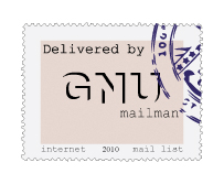 |
One more sample.. |
| Brian Carpenter |
brian@emwd.com |  |
||
| Brian Carpenter |
brian@emwd.com |  |
||
| Andrija Arsic | arsicandrija@gmail.com | n/a |  |
Logo sample |
| Lisandro Martinez Basabilvaso | lisandro@gmail.com | n/a |  |
n/a |
| Brian Carpenter |
brian@emwd.com |  |
All of my logos can be modified in case you would like something to be changed. |
|
| Andrija Arsic | arsicandrija@gmail.com | n/a |  |
Logo sample |
| Rae French |
rae@gitchee.com |  |
Designed in black for easy color change, if needed. Integrated the GNU logo for brand recognition. |
|
| Brian Carpenter |
brian@emwd.com |  |
Logo can be modified according to need. |
|
| Claudia Schmidt, Patrick Koetter |
c@state-of-mind.de, p@state-of-mind.de |
 |
Mailman is very well known. It does not need to tell everybody what or who it is. Saying "M" is enough. "M" stands for Mailman. Mailman as a brand. Extra benefit: Works well as an icon too. | |
| Claudia Schmidt, Patrick Koetter | c@state-of-mind.de, p@state-of-mind.de |
 |
A variation that places "GNU" outside, making the "M" even stronger. | |
| Claudia Schmidt, Patrick Koetter | c@state-of-mind.de, p@state-of-mind.de |
 |
Variant of 1a without "metal"-effect. More cool and elegant. Less fancy. Works well as an icon or logo in situations when Mailman is used within the context of another website, where the website design should have the design lead. |
|
| Claudia Schmidt, Patrick Koetter | c@state-of-mind.de, p@state-of-mind.de |
 |
A variation that places "GNU" outside, making "M" stronger. | |
| Claudia Schmidt, Patrick Koetter | c@state-of-mind.de, p@state-of-mind.de |
 |
"Mailman" in a speech bubble, because people use "Mailman" to communicate. A very modern approach that brushes off the dust of "mailing list managers" and puts it into context with forums, jabber, twitter et. al. |
|
| Claudia Schmidt, Patrick Koetter | c@state-of-mind.de, p@state-of-mind.de |
 |
A more compact version. More modern, more icongraphic. |
|
| Claudia Schmidt, Patrick Koetter | c@state-of-mind.de, p@state-of-mind.de |
 |
A tribute to the current, established logo. A classic typo that alludes to the postal stamp in the old logo. The stripes play along the stripes on the old logo, but use a cleaner form, well suited for on- and offline usage. |
|
| Claudia Schmidt, Patrick Koetter | c@state-of-mind.de, p@state-of-mind.de |
 |
The stripes on their own. A reduced version of 3 suited to use as an icon in a browser bookmark (favicon) or on a desktop. |
| Brian Carpenter
| brian@emwd.com | |

| Again colors can be changed, tagline, etc.
|
